Templates & writing
Use your logo without overwhelming the card
Make branding recognizable while leaving room for the greeting.
By LoopLily · 1 min read
Choose a readable source
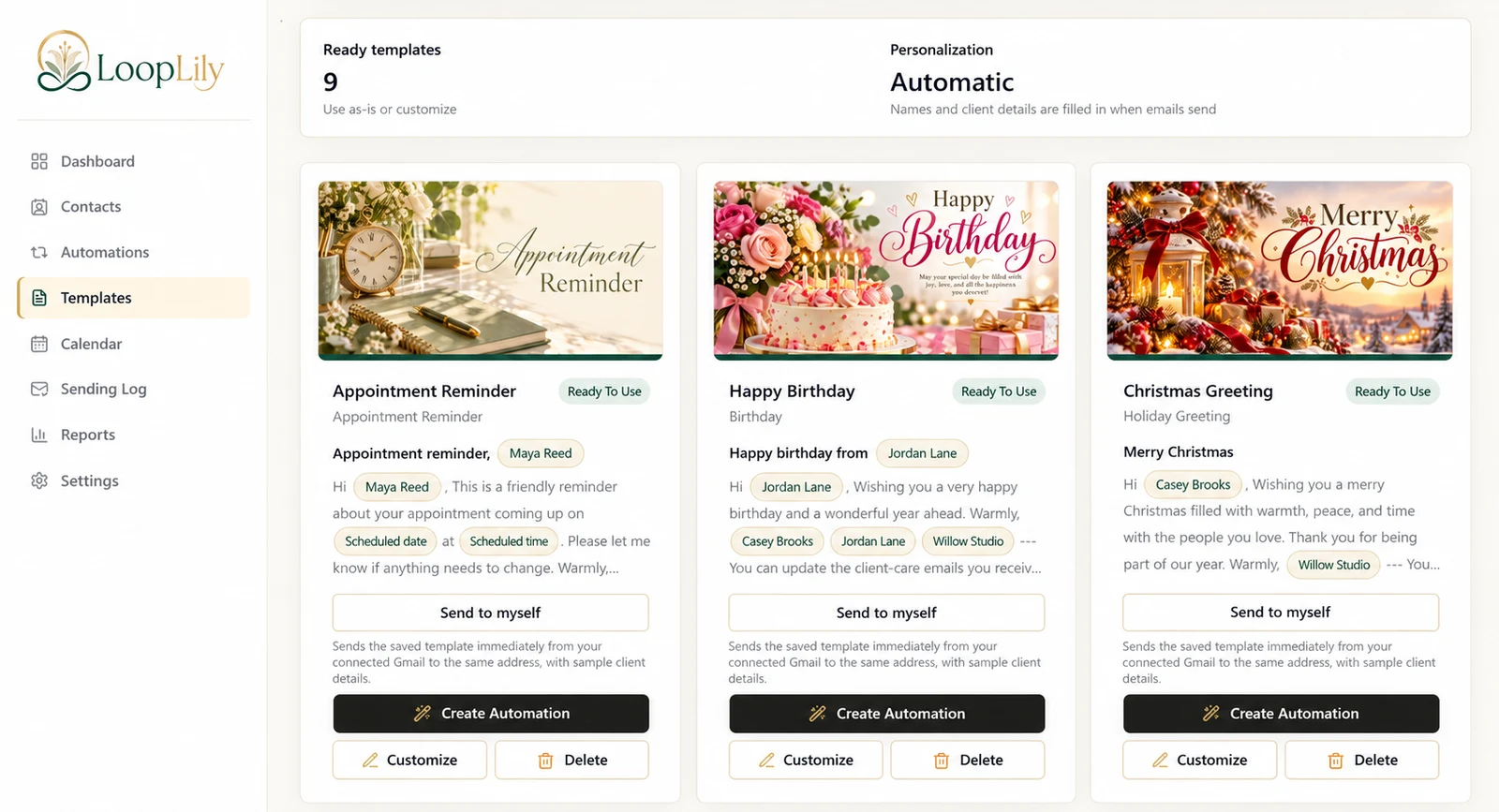
Use a logo that remains clear at the size shown in an email. Fine text and intricate details may become difficult to read when reduced. Review the uploaded asset against the light or dark areas where it appears, rather than assuming it works equally well everywhere.
Avoid repeated branding
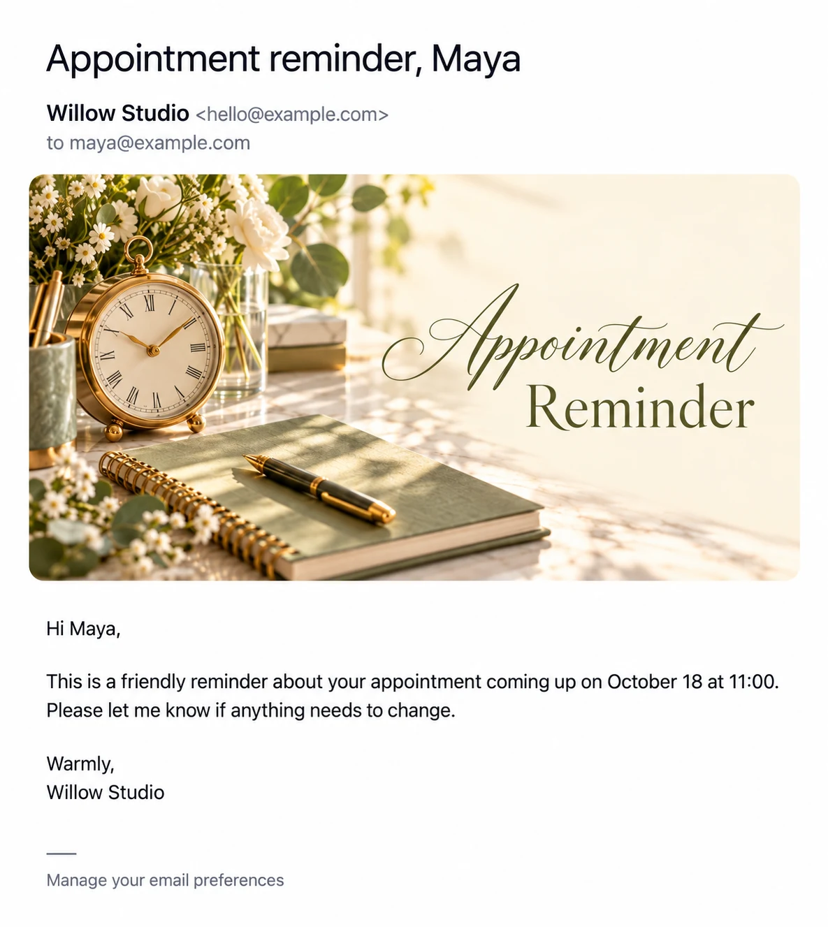
If the card artwork already contains a business mark, adding the same logo again in the body may feel crowded. Inspect the complete preview and decide which placement does the job best. The greeting should still be the main focus of a birthday or holiday message.
Check after every visual change
A new card image can change the contrast and balance around a logo. Send yourself another preview when you replace artwork or update your brand colors. Also read the plain text signature for consistency. A recognizable company name and one clear logo placement usually communicate identity more effectively than several competing marks scattered through a short email.